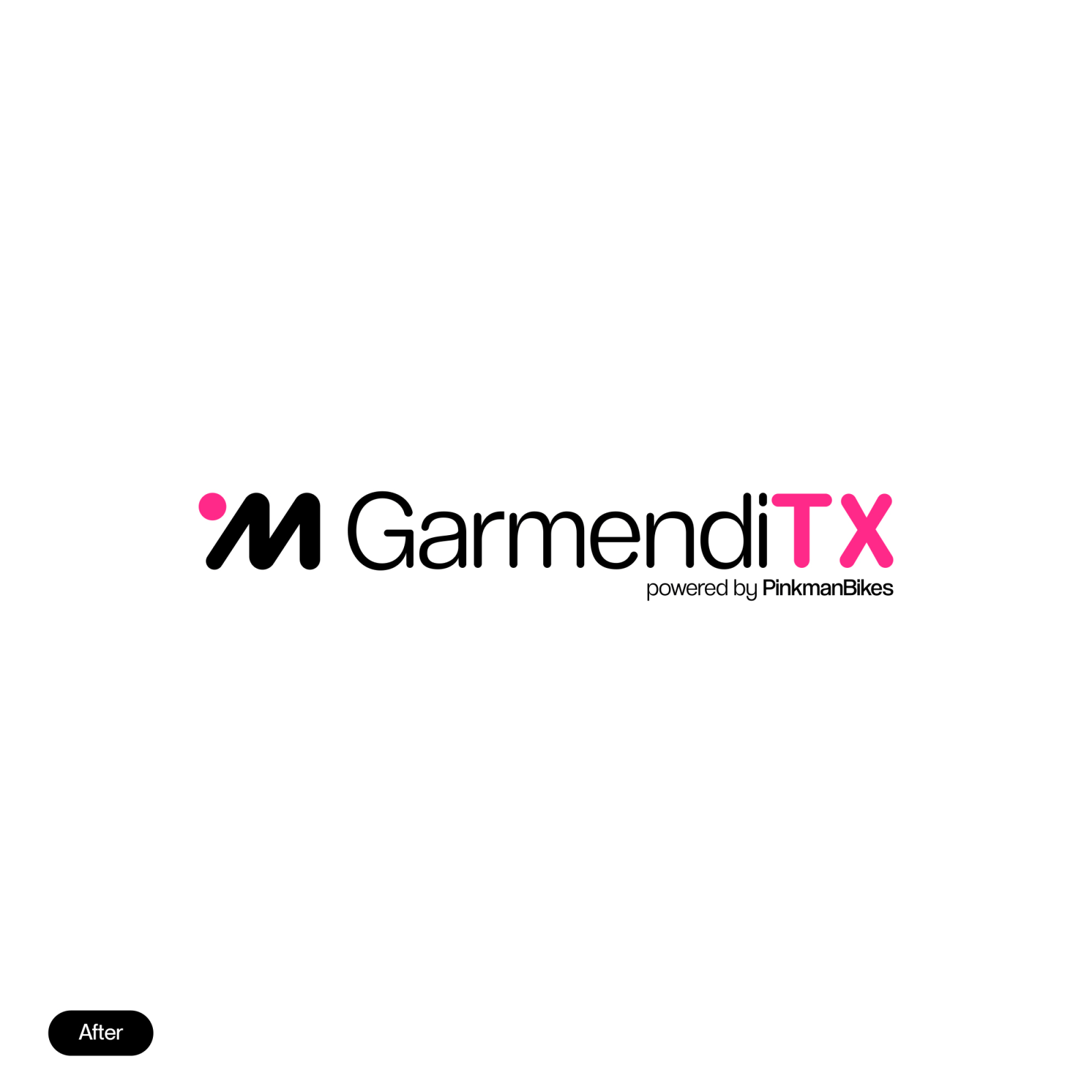
GarmendiTX
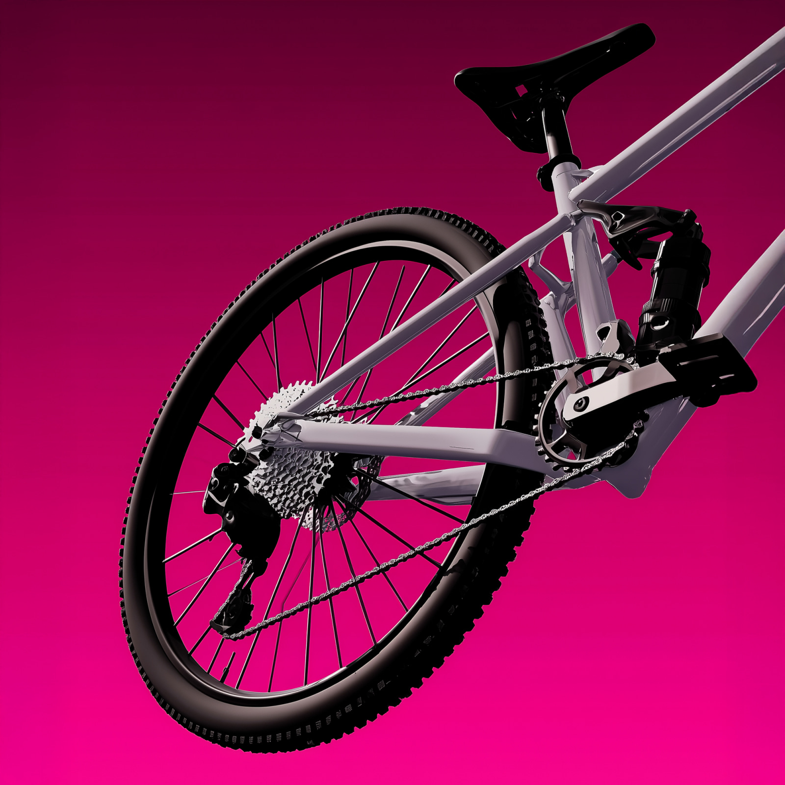
Garmendi TX started as a neighbourhood bike shop: repairs, rentals and a personal touch. As the business grew, its identity no longer kept up.
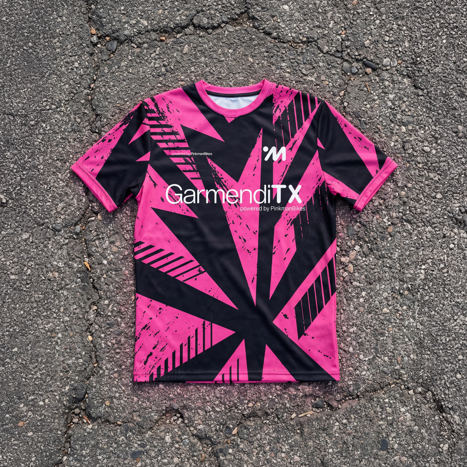
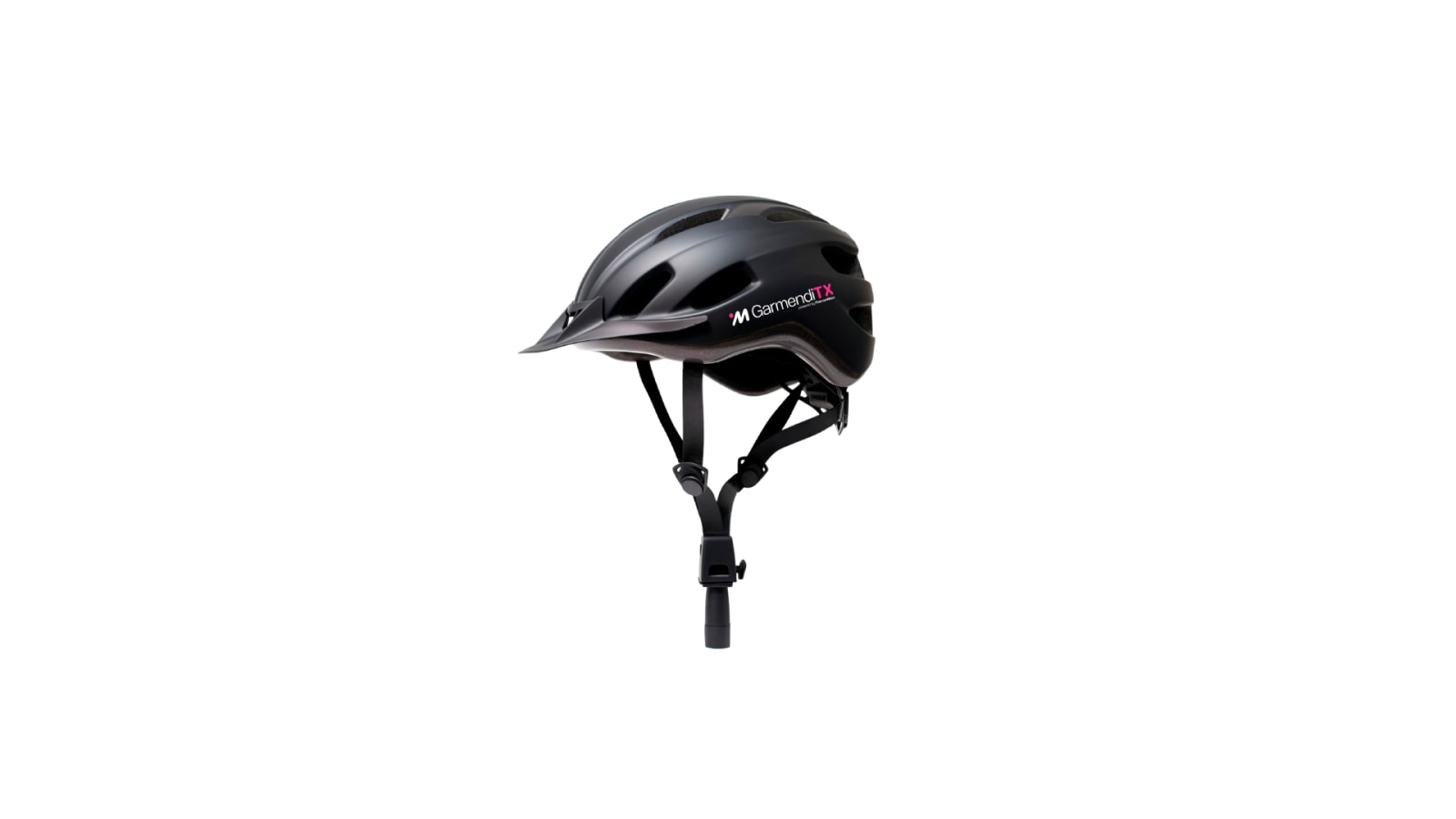
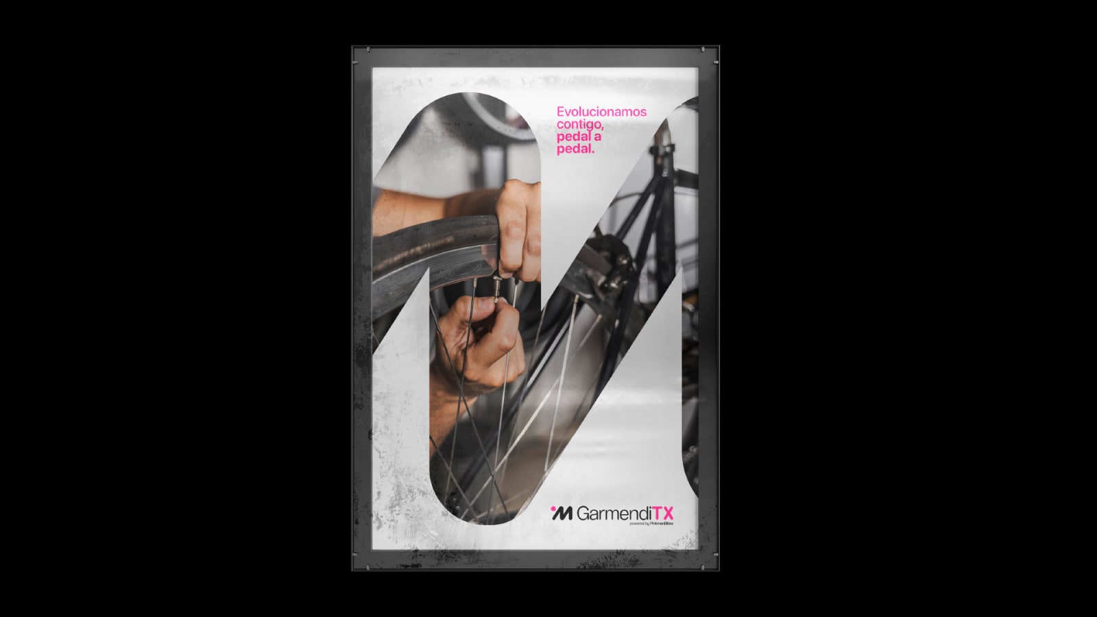
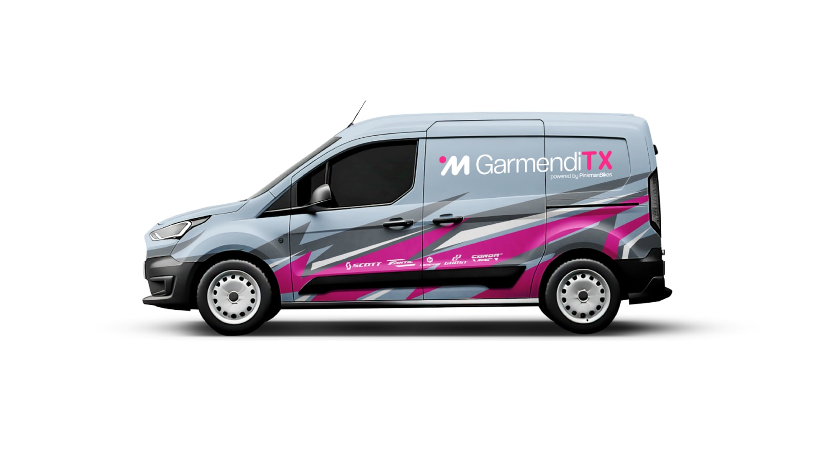
We rebuilt the brand around a refined “M” symbol, a colour palette and a typographic structure that work just as well in the workshop as on a T-shirt or on Instagram.
The result is a more professional brand, ready to scale, that keeps the warmth it became known for.
2025Mobility & TransportBranding







Credits
- Creative Direction
- dõlmen®
- Design
- dõlmen®